Subscribe To Our Blog!
Keep up with the latest discussions, industry trends, and customer news.
Sign me up!

Categories
Advanced Analytics (22)
Data Modelling (1)
Machine Learning (1)
Data Warehouse (2)
Inside Info (8)
Data Integration (2)
Analyst Reports (11)
Business Analytics (102)
4 Tips To Create Data-Driven Dashboards That Add Value
By on Mar 22, 2017
Depending on the role, different people in a company typically have different reporting and analytics needs. Whether you’re building a business intelligence dashboard for the executive team or an operational team, do your dashboards tell the story you want to get across or does the insight get lost in a sea of KPI’s? Here are a few tips to keep in mind when designing and building great dashboards.
1. What story are you telling?
As with any communication, the first golden rule is to understand who it is you’re trying to persuade, inform and engage with your dashboard. Once you understand this group and how they consume different types of information, storytelling then becomes an important skill. Humans have long been engaged in storytelling, it’s one of the cornerstones of communication. In fact, stories are remembered up to 22 times more than facts alone. With that in mind, taking a structured narrative approach to your business data can help make it more understandable, memorable and persuasive.
By assembling your data into a story, it creates cohesiveness and structure for presenting that data. The most engaging stories are conversations, giving listeners room to ask questions, just like an interactive data visualization. So being able to share your insight with others is a priority. Dresner’s Collective Insights Report last year found that collaborative BI has become a necessity while Aberdeen found it also can drive an impressive 18% more revenue growth in organisations. Our article on how to foster a collaborative analytics environment explores this further.
Qlik Sense’s unique data storytelling capability fosters collaborative business intelligence allowing you to move seamlessly between presentation mode and the original data set to answer questions on the fly, while its powerful visualisations support the narrative.
2. Choosing and displaying the right metrics
Excess information, confusing graphics and unnecessary features can make a dashboard difficult to use and understand. You should “remove everything you can and nothing else”. If you have only one minute before a dashboard must be completed, ask yourself what to remove—not what’s missing. This will give you a good feel to what should be included in the application. Always remember to take it back to your audience and who are the main users of the dashboard and the metrics they want to be able to view easily and quickly. Smart search capabilities built into the dashboard can also connect the dots between data making it easier to find answers.
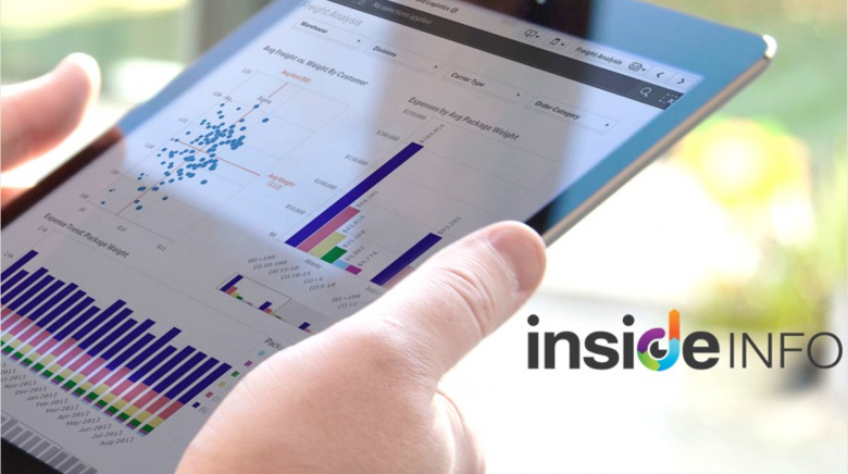
By incorporating data visualizations into your dashboards complex data can become clearer to see trends and correlations that aren’t visible in rows and columns. There are some guidelines however to best practice. Be careful not to overdo your use of colour, while universal colours like red and green if used should convey good or bad performance in graphs. Keep your dashboard design simple by limiting the number of KPI’s in a dashboard to 9 or less and avoid visual clutter. Choose the right chart for the right purpose. For example, pie charts are good for comparing parts of a whole on a limited data set, while scatter plots are great for analysing product performance or margins to see any outliers that need attention.
Qlik’s simple drag-and-drop interface and smart visualizations use new techniques that make it easy to convey meaning in data. Each chart is fully interactive, one click from summarised to transactional level detail, while visualizations dynamically update to changes made anywhere in the app. Each chart is also a responsive design, automatically adjusting to screen size and mobile touch.
Incorporating mapping and location intelligence may be important for certain dashboards if looking at different channels, suppliers, client or product dispersion. It becomes another tool to display and navigate insights. If this is important, check out Dresner’s new study on location intelligence.
Remember design is not just what it looks like and feels like. Design is how it works.
3. Responsive Design & easy to manage
A good dashboard isn’t a one-size-fits-all approach. That means, if delivering a dashboard for a mobile deployment is required, the BI software needs to be smart enough to automatically re-render its design to best fit the deployment. If not, it becomes a costly exercise in building the same dashboard for a server deployment, then a mobile deployment, as simply shrinking a desktop version of a dashboard to an Ipad isn’t a great user experience in terms of functionality and form. So look for business intelligence platforms that can provide access on any device, anytime, automatically adapting to the device, being HTML5 compliant.
Ensuring the dashboard is easy to use is a given, but being easy to manage is also important. There needs to be strong data governance built behind each dashboard, so everyone is still working from a single version of the truth. This may take the form of inbuilt security or leveraging governed data libraries of data models, applications, data definitions and data stores. This ensures scalability as your organisation grows, especially if leveraging self-service BI applications.
4. Automate Data Integration & Consolidation
According to IDC the average employee spends over six hours each week on data-gathering, compared to just over four hours on consolidation and analysis. Minimising this time by making it easy for employees to access relevant data in a timely manner must be a priority for firms looking to maximise productivity & reduce unnecessary costs. Because data collection has traditionally been a manual process, even when traditional BI tools are in play, it has been both slow and labour intensive. System and data integration are often cited as the main limitations of current BI systems or processes.
However, sophisticated BI tools like Qlik Sense software have upended this paradigm, providing point-and-click data integration from any and multiple data sources, while business users have the option to create their own powerful dashboards and analysis simply on the fly - or to use guided dashboards created by IT. Each, however, allows for full, drill-down capability from a summarised view of data to transactional level detail, quickly and easily on a consolidated view of data across the enterprise.
The value of self-service analytics over outsourced methods cannot be overstated. Forbes found that close to 90% of industry leaders - more inclined to use this distributed BI framework - report seeing significant business benefits from their BI software. This is in stark contrast to organisations overall, where only 53% have the same positive view.
If you want to know more about Qlik and how it can help you create simple, intuitive and powerful dashboards, view the ebook below.

Sonia Johnson
Sonia Johnson heads Inside Info's Marketing team, as an experienced B2B marketer, having launched and built the Qlik brand in the Australian market. Sonia has 20 years' experience working within the IT and telco industries, having worked for IBM and Vodafone, the last ten years have been focused within the business intelligence and corporate performance management sectors.
Related Articles
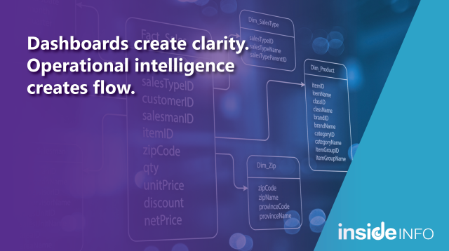
The question isn’t simply whether we can see what’s happening, because in most organisations, we can. The more pressing conversation now is what we do with that data and clarity.
By
on Mar 16, 2026